Making a brand feel unmistakable in digital
Most of my work comes down to one thing: helping a brand feel like itself inside a real digital product. Not just a logo and a colour, but the shape, type, motion and small details that make an app or a website unmistakably one brand.
I've done this across large brands — KLM, Odido, Philips — usually at the point where a brand has been renewed but the product hasn't caught up yet. This page is the hands-on service. For the bigger, multi-team framework version, see DXDL.
What I help with
- Translating a brand into how a product looks, moves and feels
- Foundations that carry the brand: colour, type, shape, iconography, motion
- Making an existing product feel recognisably on-brand again
- Keeping one identity coherent across web, app and other touchpoints
Why this matters
Brands get renewed all the time; products rarely catch up at the same speed. So you end up with a sharp new identity that barely shows through in the day-to-day experience. Closing that gap — making the brand tangible in the product, not just in the guidelines — is where I'm most useful, and it's what the KLM, Odido and Philips work was really about.
Where I've done this
KLM
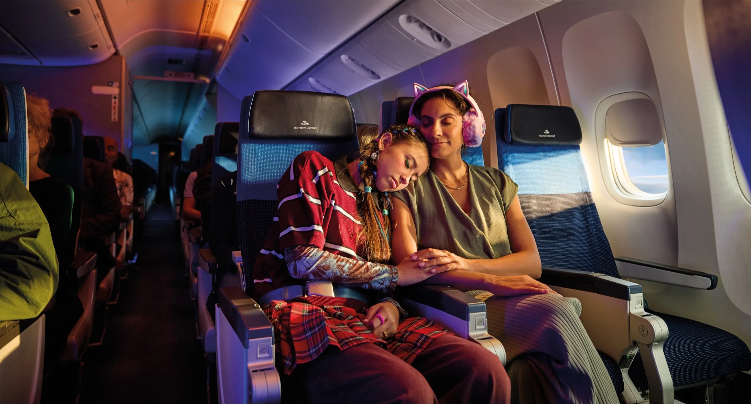
With Laurens Beil and a small core team, we refreshed KLM's digital brand across a very wide range of touchpoints — app, website, email, airport kiosks, inflight entertainment, campaign assets. The goal was simple to state and hard to do: make every touchpoint feel unmistakably KLM. We got there by strengthening the foundations first — colour, type, a distinctive shape language, iconography, motion and illustration.
Odido
For the T-Mobile → Odido rebrand, I worked on the design system side of a brand-new identity — a custom typeface aligned to the shape language, a new icon set built on the same logic, illustrations and motion — so the brand felt like one coherent thing whether you met it on web, app or TV. The rebrand won a Diamond Sabre Award for Brand-Building.
Philips
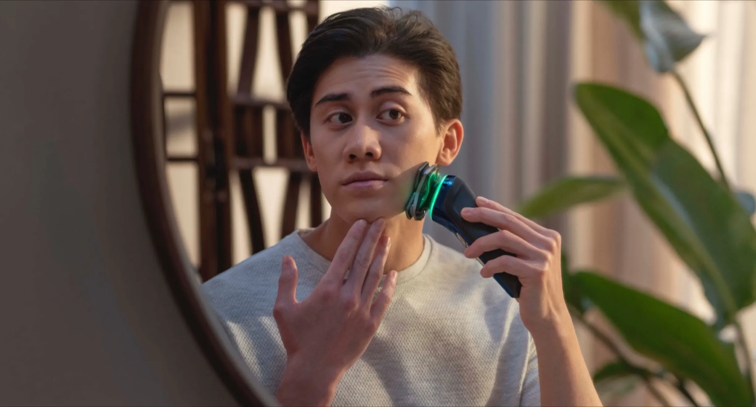
On philips.com, brand expression had to live alongside commercial clarity. We built a colour system rooted in the Philips brand that still flexed across categories from personal care to home appliances — recognisable without getting in the way of the purchase.
How I work
- Find where the brand disappears
I look at where the product stops feeling like the brand — usually in the everyday screens, not the hero moments. - Strengthen the foundations
Colour, type, shape and motion do most of the work of making a product feel like one brand. I start there. - Make it hold across touchpoints
The test isn't one beautiful screen; it's whether the brand still reads the same across app, web and everything else.
FAQ
What does 'digital brand experience' mean in practice?
Making a brand recognisable inside the actual product — not just in a logo or a campaign, but in how the interface looks, moves and feels. On KLM the goal was simple to say and hard to do: make every touchpoint feel unmistakably KLM, from the app to airport kiosks and email.
Is this the same as the DXDL framework?
No. This is the hands-on version: me, working on how your brand shows up in a specific product. A Digital Experience Design Language is the larger, multi-team framework Laurens and I run to realign brand and product across a whole organisation. If you want the framework, see the DXDL page.
Do you only do the visual side?
It usually starts with the foundations that carry a brand — colour, type, shape, motion, iconography — but the point is how they add up in the experience. On Philips that meant a colour system rooted in the brand that still worked across very different product categories; on Odido it meant one coherent identity across web, app and TV.
Want your brand to actually come through in the product?
Let's talk.