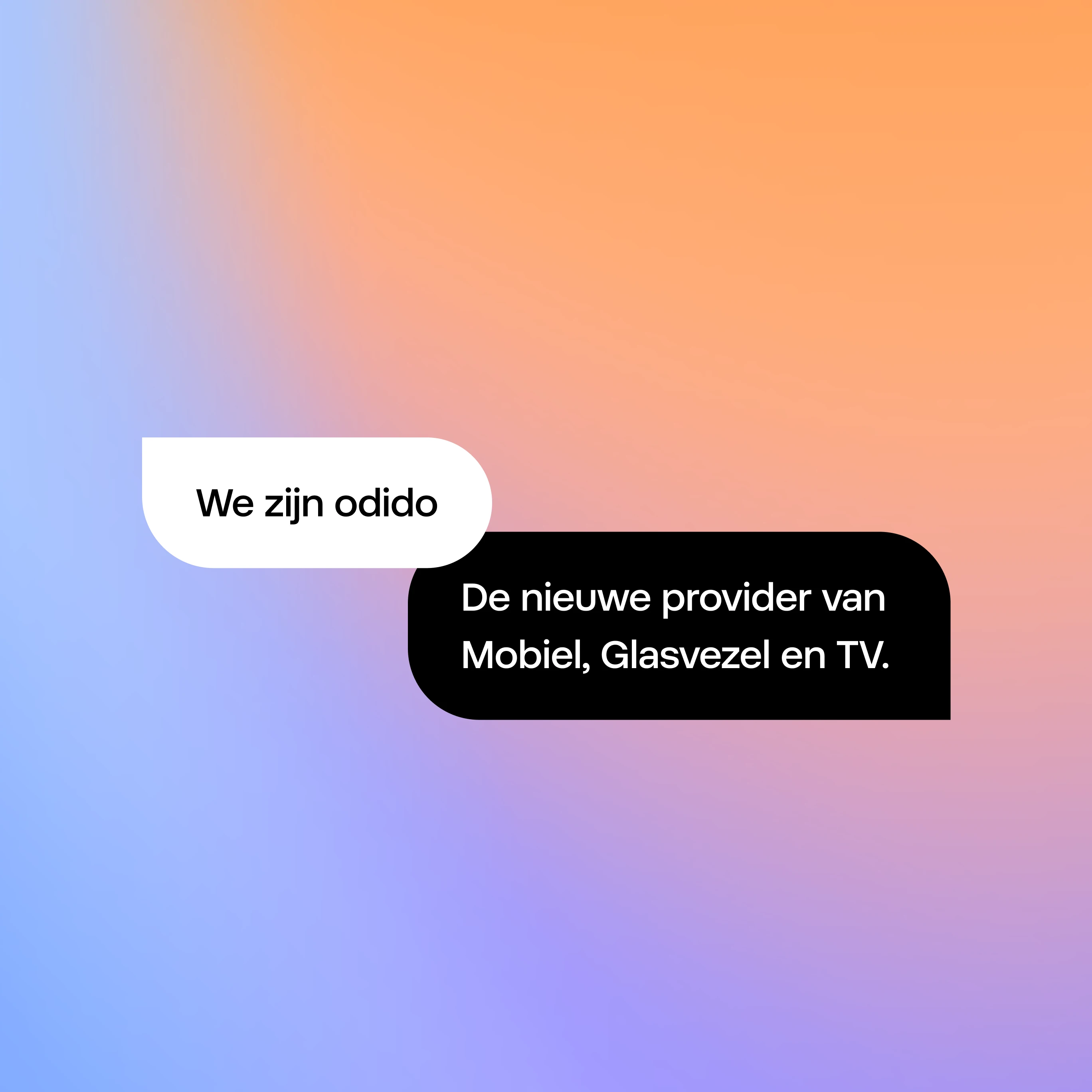
Odido rebrand and design system
I had the privilege of collaborating on the odido rebrand as part of a team from Code d'Azur / Hypersolid, where we were responsible for the design system side of the transformation. Over the course of roughly nine months, we rebuilt the core foundations, redefined the component library, and helped translate the new brand into a scalable digital system across platforms. The goal was to make the new identity recognisable, usable, and consistent, whether experienced on web, app, or TV.
Odido's rebrand required more than a visual refresh. It needed a system that could support multiple teams, multiple platforms, and a broad set of use cases, while still feeling like one coherent brand. We worked alongside designers shaping the new experience across different products and touchpoints. Our role was to make sure the brand could be translated into a practical system: one that was clear, scalable, and robust enough to support the redesign beyond individual screens.
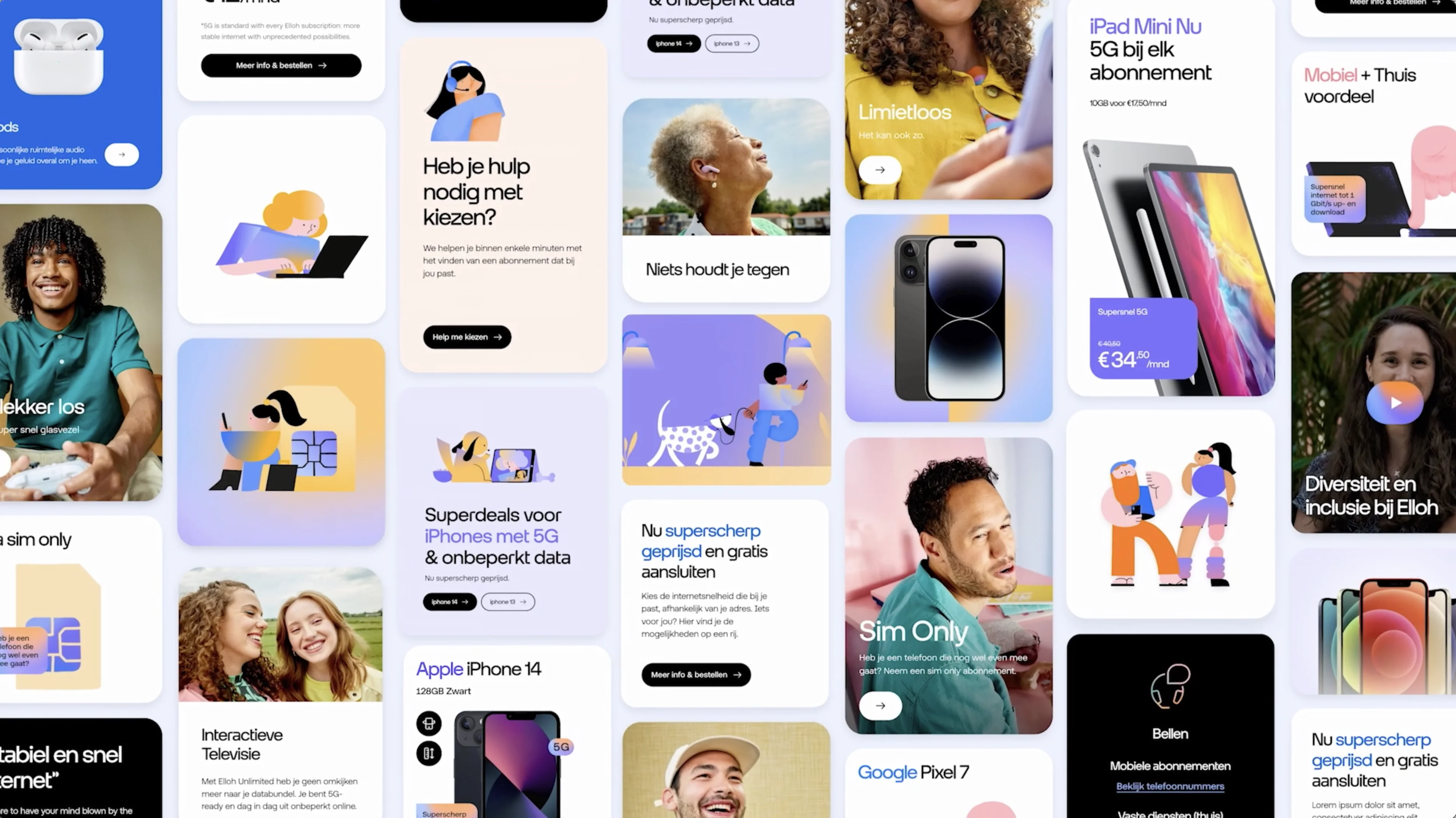
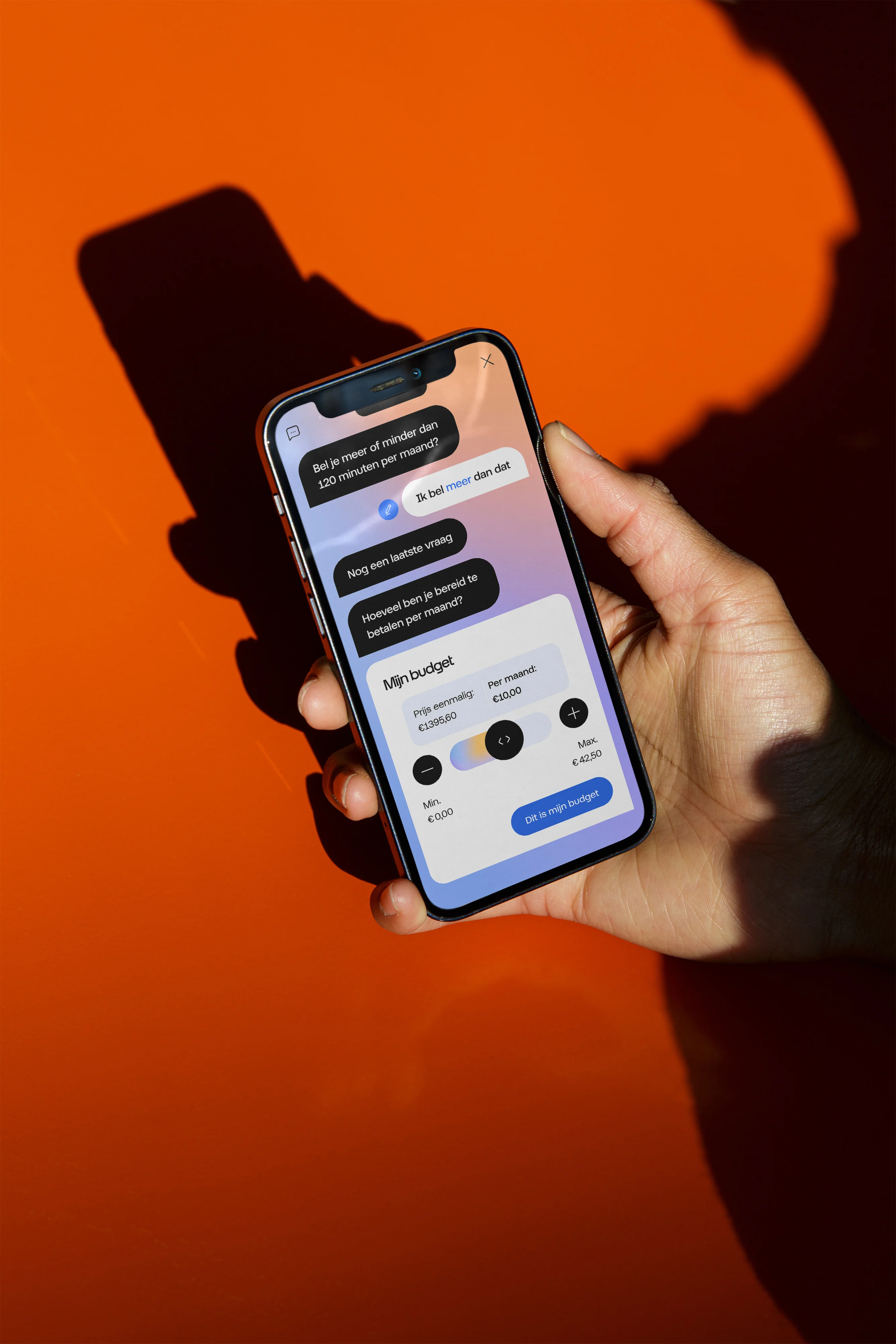
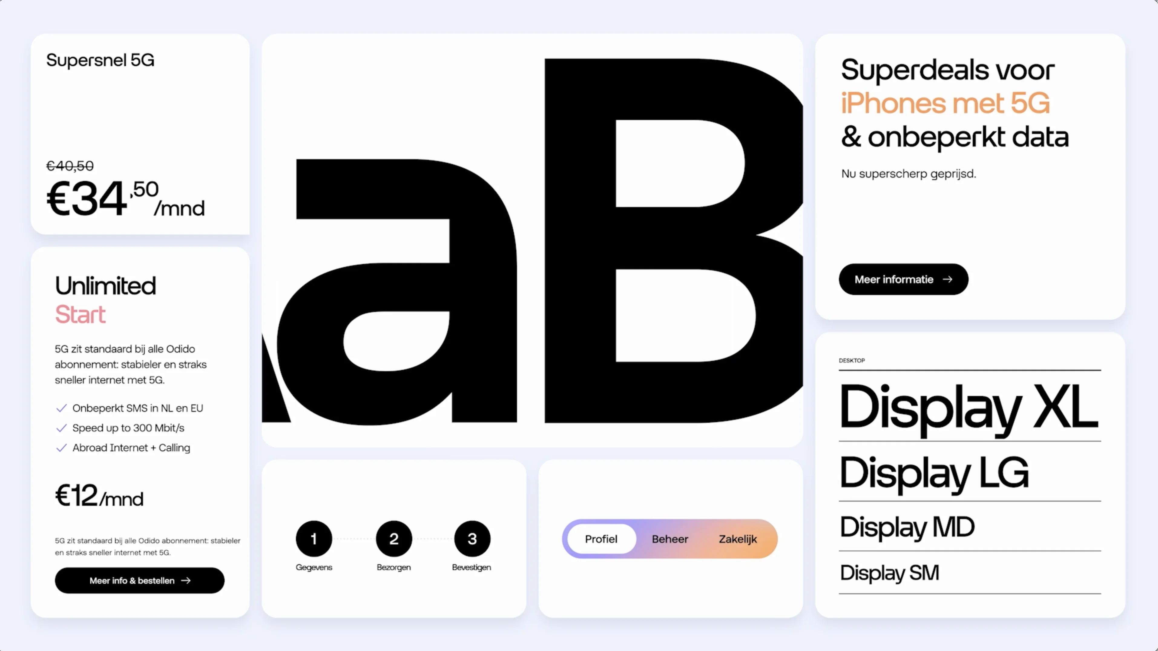
We started with the foundation. Before scaling the brand across pages and products, we focused on the essentials: type scale, colour system, component definitions, and the underlying logic of the library. From there, we rebuilt the component library and mapped components back to clear design principles and intended usage. We also worked closely with the concept design team. They often pushed the brand into more expressive directions, and our job was to translate that work back into the design system so it could be reused, maintained, and scaled across the product ecosystem.
Building the foundation for scale
A major part of the project was creating a solid system foundation that could support the new brand across products and teams.
That meant defining a clear and usable type scale, refining the colour palette, and setting up components in a way that made them easy to understand and apply. Accessibility was an important part of this work, helping ensure that the system was not only visually aligned with the rebrand, but also practical and inclusive in use.
Because the timeline was relatively short, we also had to be pragmatic. In many cases, existing component patterns were reused, adapted, and redesigned rather than reinvented from scratch. That allowed us to move quickly while still creating a system that felt purposeful and consistent.
Translating brand into a cross-platform system
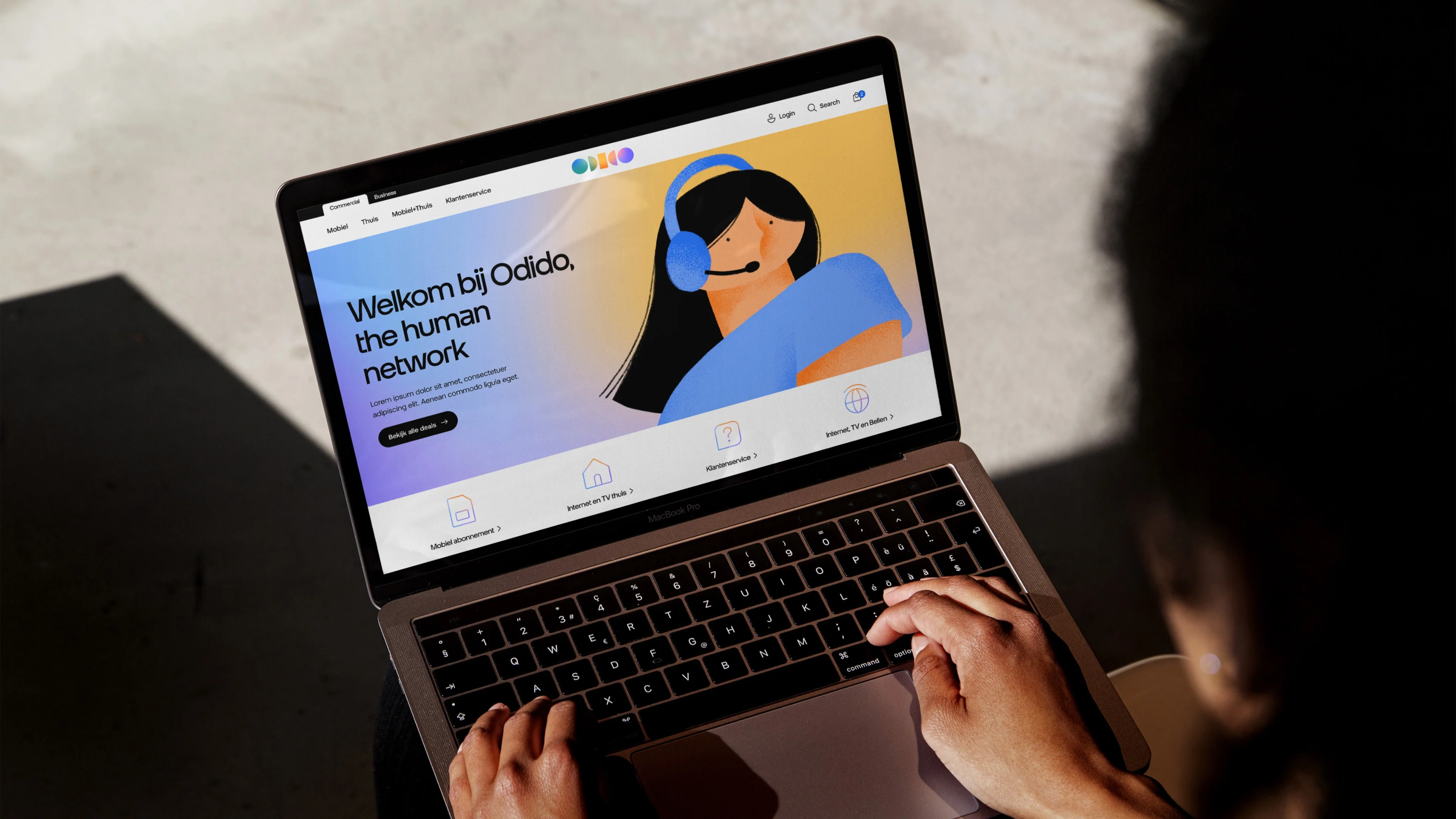
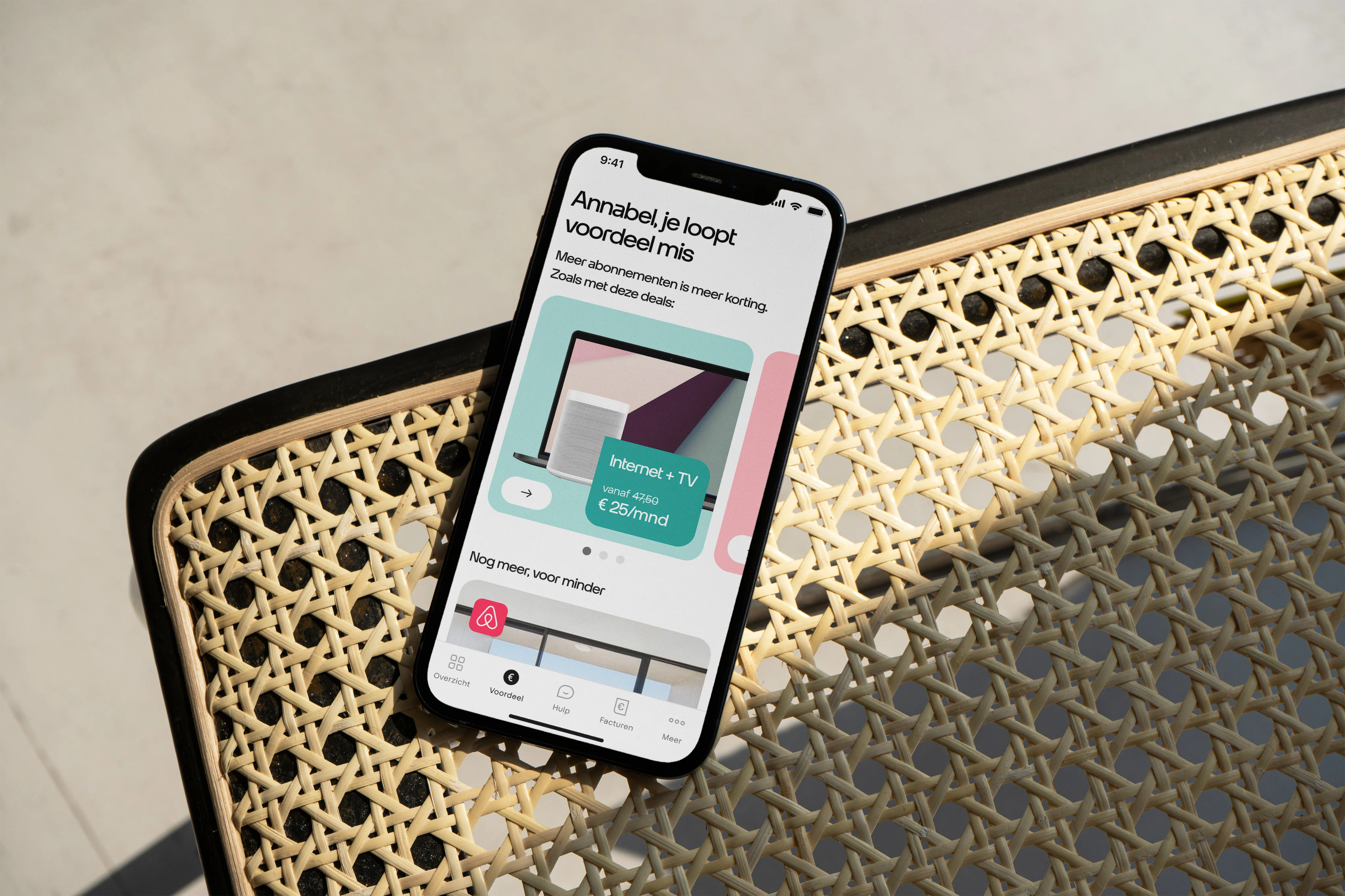
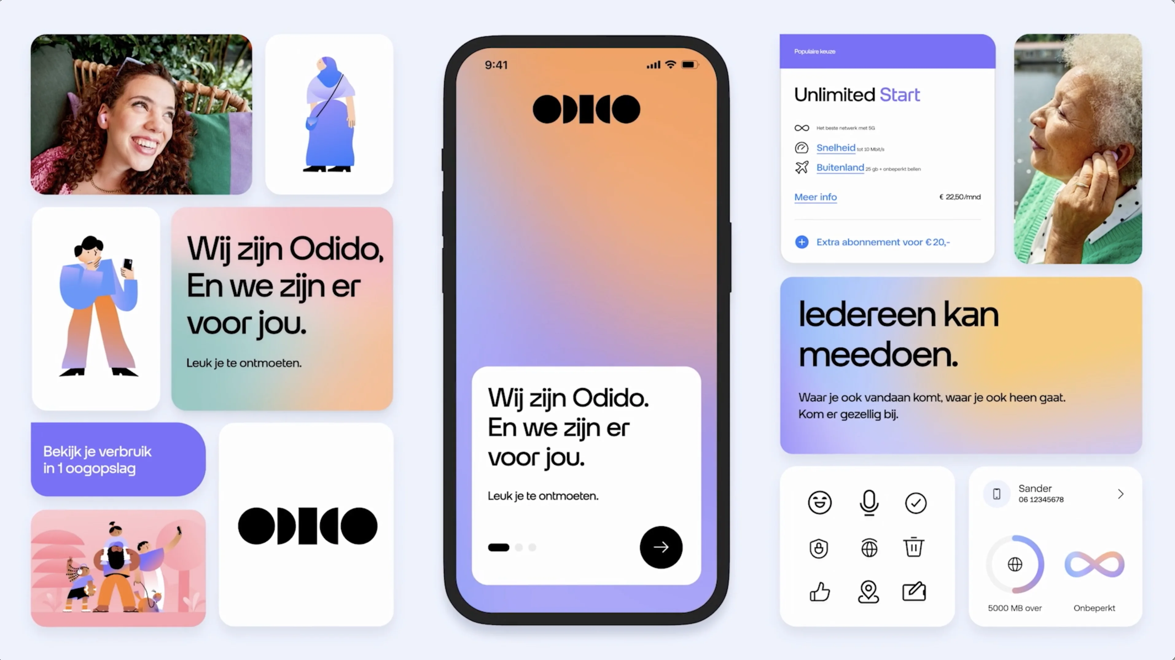
One of the most important outcomes of the work was making the Odido brand feel consistent across very different platforms.
The system was designed to create a recognisable visual language that could scale from web pages to apps and TV experiences. Shape language, colour, typography, iconography, and illustration all worked together to build that consistency. The result was a brand that felt unified across touchpoints, rather than fragmented by platform.
This was especially important in a rebrand of this scale. For a major telecom and TV provider, consistency is not just a design detail, but part of how the brand becomes familiar and memorable in everyday use.
Crafting the brand language
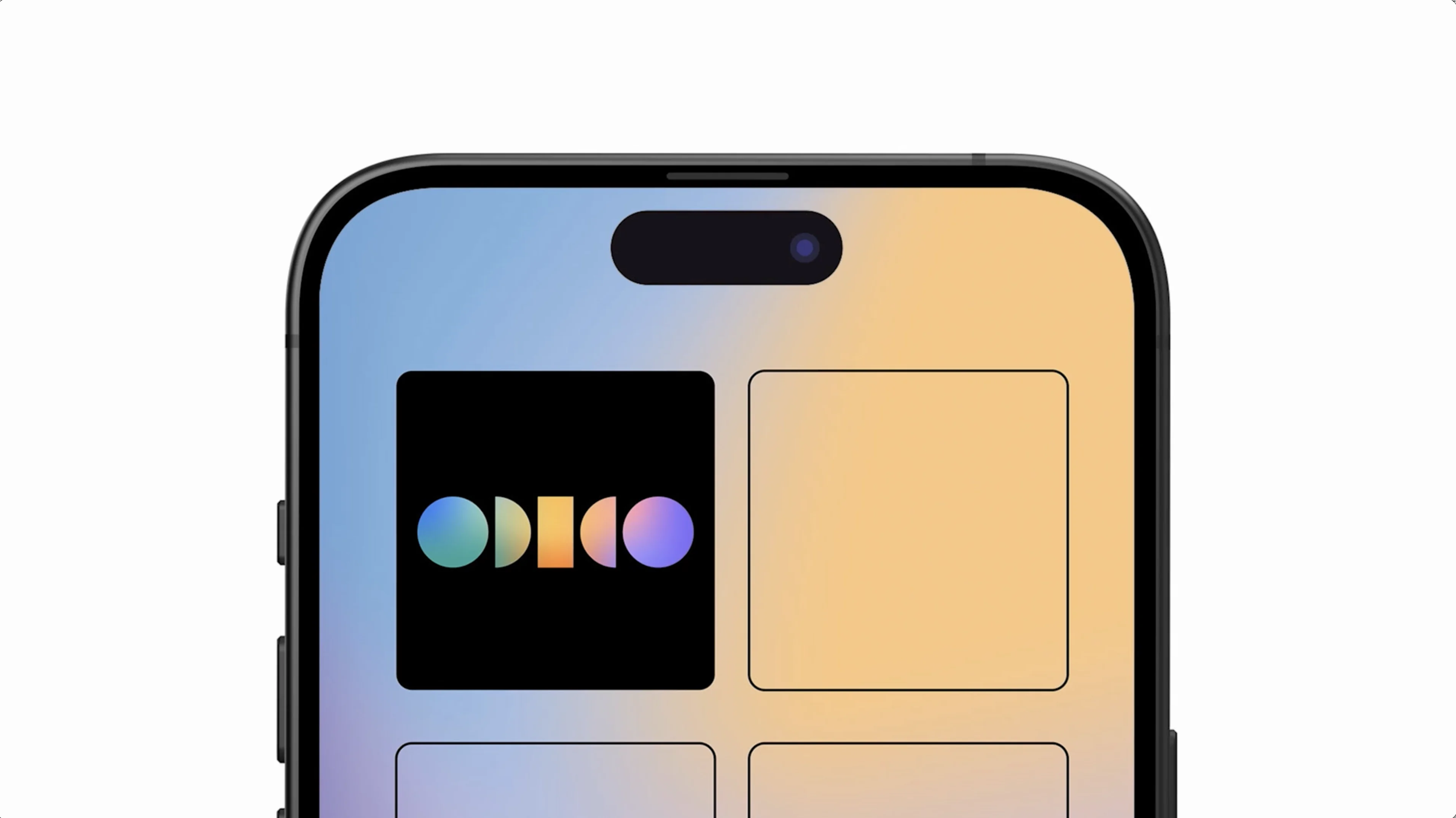
Alongside the system foundations, the project included several key brand assets. A completely new icon set was designed and integrated across the ecosystem. Illustrations developed by Puck were also brought into the system and implemented as part of the broader visual language. A custom typeface was created to align with the new shape language, and that same visual logic carried through into the iconography. This helped create a tighter relationship between different parts of the identity, making the system feel more intentional and recognisable as a whole.
The result was a scalable design system that helped turn Odido's rebrand into something usable across real products and platforms. By building strong foundations first and translating expressive brand work into repeatable system logic, we helped create a more coherent and recognisable digital experience.
It gave teams a clearer structure to design with, while helping the new identity feel consistent wherever customers encountered it.