
Redesigning the philips.com e-commerce platform
As part of a team at Code d'Azur, I worked on the redesign of the philips.com e-commerce platform. The goal was to modernise the shopping experience across product categories and markets, and to build a scalable design system that could support Philips' global digital presence going forward.
The challenge
Philips' e-commerce platform had grown organically over time, resulting in an inconsistent experience across product categories and markets. Different teams used different visual languages, making it difficult to maintain quality and consistency at scale. The challenge was to create a unified design foundation — one that was flexible enough to work across categories, markets, and touchpoints, while still feeling like a single, coherent brand experience.
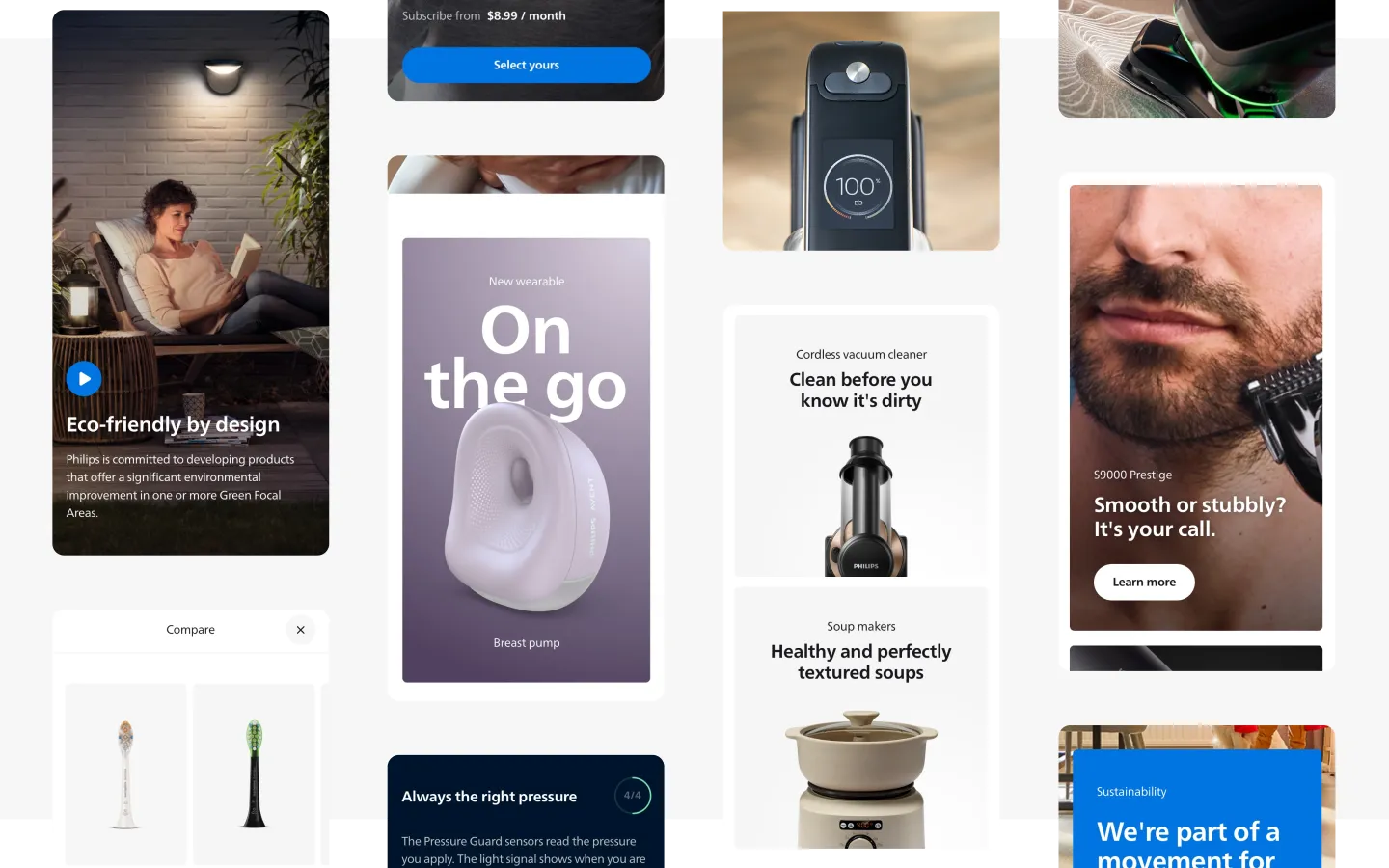
Building a colour system rooted in the Philips brand
Colour is one of the most immediate expressions of the Philips brand. The challenge was to create a system that was both flexible and consistent — one that could work across a wide range of product categories, from personal care to home appliances, while still feeling distinctly Philips.
We started by auditing the existing colour usage across the platform and identifying where inconsistencies were causing problems. From there, we built a structured colour system with a clear hierarchy: a core palette rooted in the Philips brand, combined with a set of functional and category-specific colour roles. The result was a colour language that teams could apply confidently, knowing it would always feel on-brand.
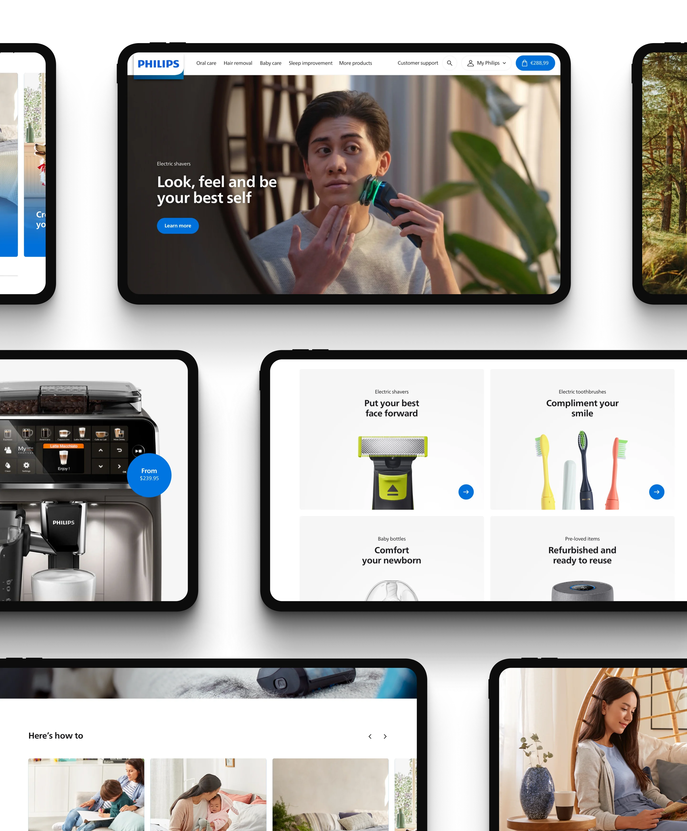
Designing for the full customer journey
A purchase on philips.com isn't a single moment — it's a journey that spans discovery, consideration, purchase, and beyond. Each step has its own context, needs, and expectations. Designing well for this journey meant thinking beyond individual pages and instead focusing on how the experience flowed from one touchpoint to the next.
We mapped out the key stages of the customer journey and identified the design patterns that needed to be consistent across them. This gave us a clear framework for how components should behave at each stage, and how the visual language could adapt to support different types of content — from rich storytelling on category pages to precise, functional detail on product pages.
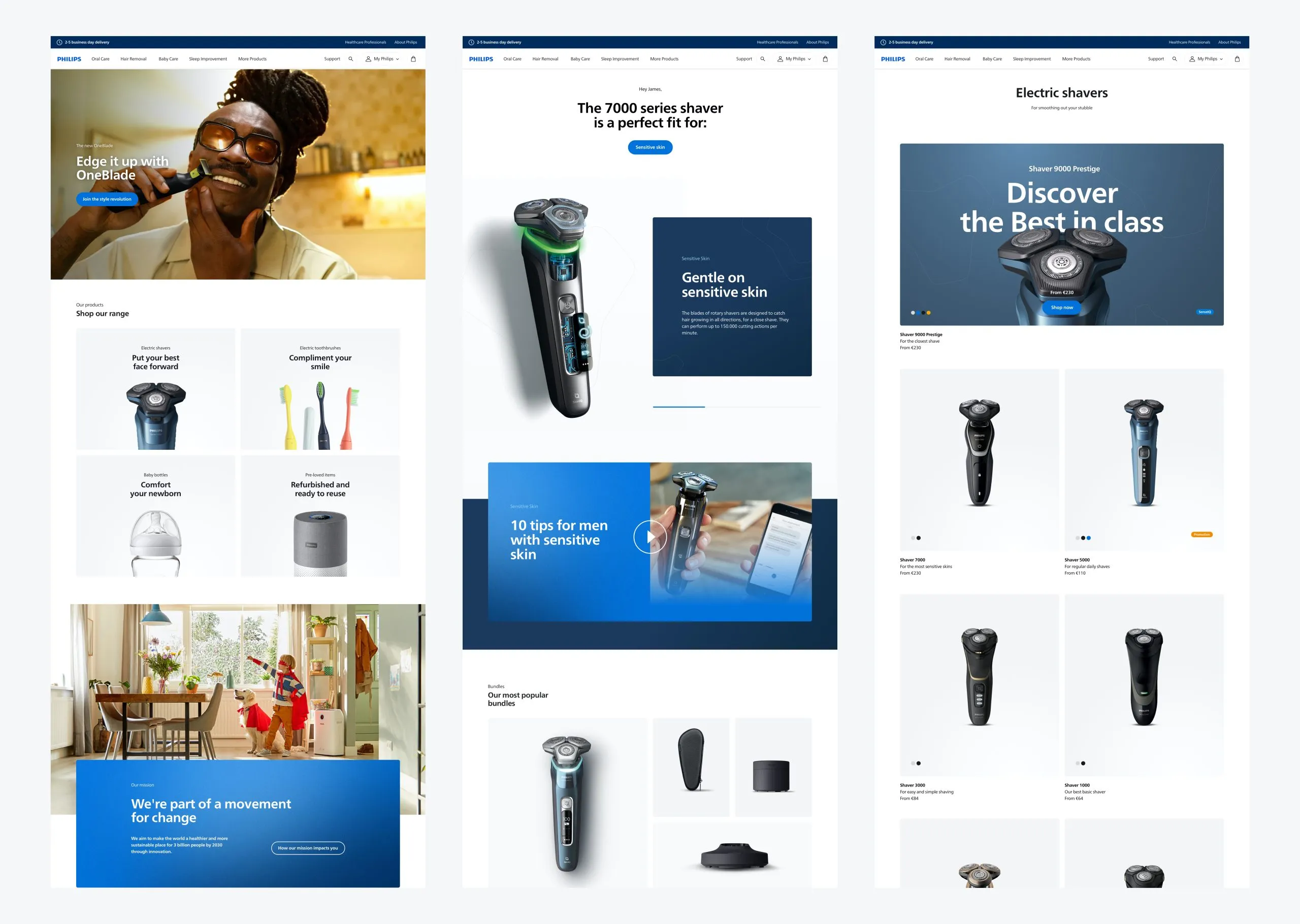
Flagship product detail page
One of the page types we designed was the flagship product detail page, created for Philips' most important products within a category. These pages were designed to do more than present specifications. Their role was to drive consideration and purchase by combining product benefits, rich storytelling, feature highlights, comparison cues, and trust-building content into one clear experience.
This made the page work not just as a standard PDP, but as a more persuasive commercial landing experience for premium or high-priority products. It helped position the product more strongly, while giving users the depth of information they needed before making a purchase decision.
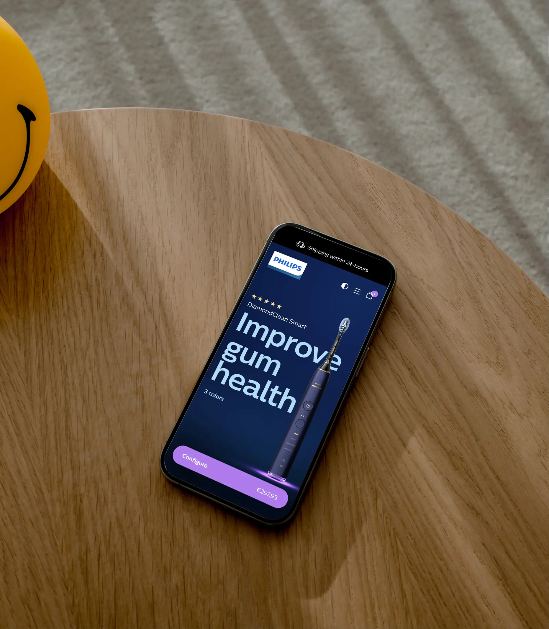
Post-purchase product page
We also designed a post-purchase product page that adapted to customers after they had already bought a product. For example, when someone logged into their Philips account six months after purchasing a shaver, they would no longer see the same pre-purchase product story. Instead, the page would shift to a more relevant ownership experience.
At that stage, the page could surface replacement parts, new shaving heads, accessories, care instructions, or other support content related to the product they already owned. This helped turn the product page into a more dynamic and personalised touchpoint, supporting customers throughout ownership rather than ending the journey at checkout.
Outcome
The redesigned philips.com platform gave Philips a scalable, coherent design foundation for their global e-commerce presence. A structured design system — covering colour, typography, components, and layout — meant that teams across markets could build consistent, high-quality experiences without starting from scratch each time.
The work touched every major touchpoint in the customer journey: from category landing pages and search results, through the product detail page, to post-purchase support. The result was a platform that felt unified and purposeful — one that reflected the quality and ambition of the Philips brand at every step.