Building a unified brand experience for KLM Royal Dutch Airlines
Over the course of 1.5 years, I worked with Laurens Beil in a small cross-functional team to help refresh KLM's digital brand identity. Together with colleagues from CX and digital marketing, we built a stronger visual foundation across KLM's digital ecosystem, from app and website to email, airport kiosks, inflight entertainment, and campaign assets. The goal was simple: make every touchpoint feel unmistakably KLM.
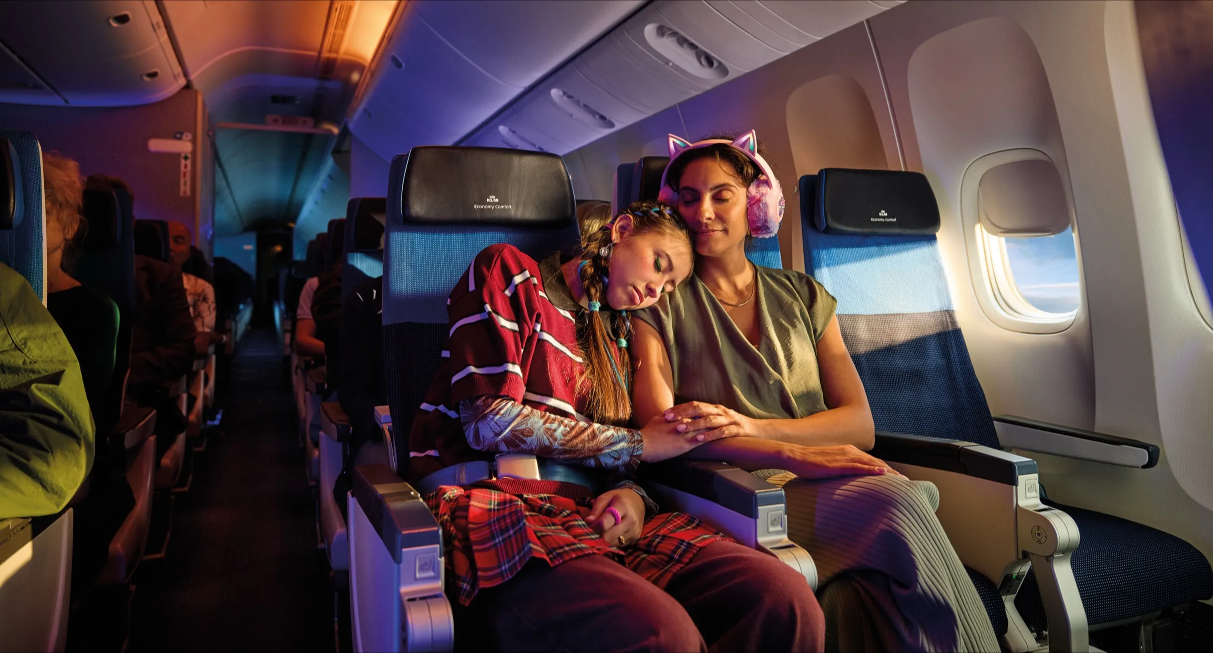
KLM operates across a very wide range of customer touchpoints. That scale creates complexity. Different channels, screen sizes, contexts, and teams can easily lead to fragmentation. Our challenge was not just to improve individual outputs, but to create a shared visual system that could bring consistency across the full digital experience.
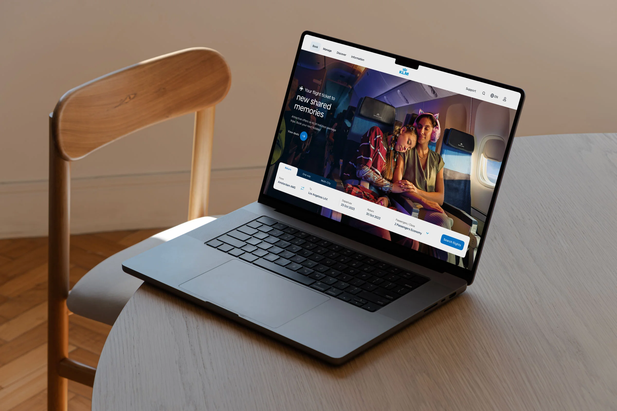
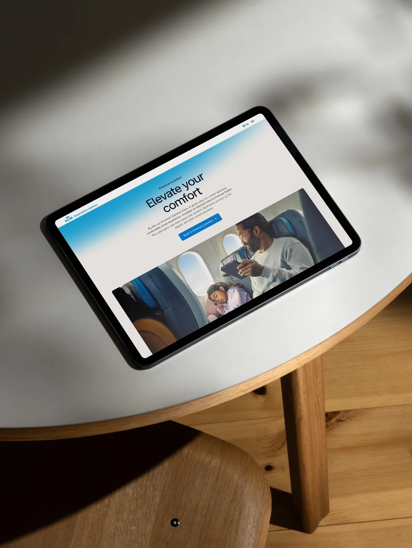
To make the brand feel more coherent across all touchpoints, we started with the foundation. Instead of designing isolated assets, we focused first on the core building blocks of the system: color, typography, shape language, iconography, illustration, and motion. By defining these fundamentals clearly, we created a base that could scale across very different use cases while still feeling recognizably KLM.
Building a stronger visual foundation
A large part of the work was about turning KLM's visual identity into a more usable and scalable digital system.
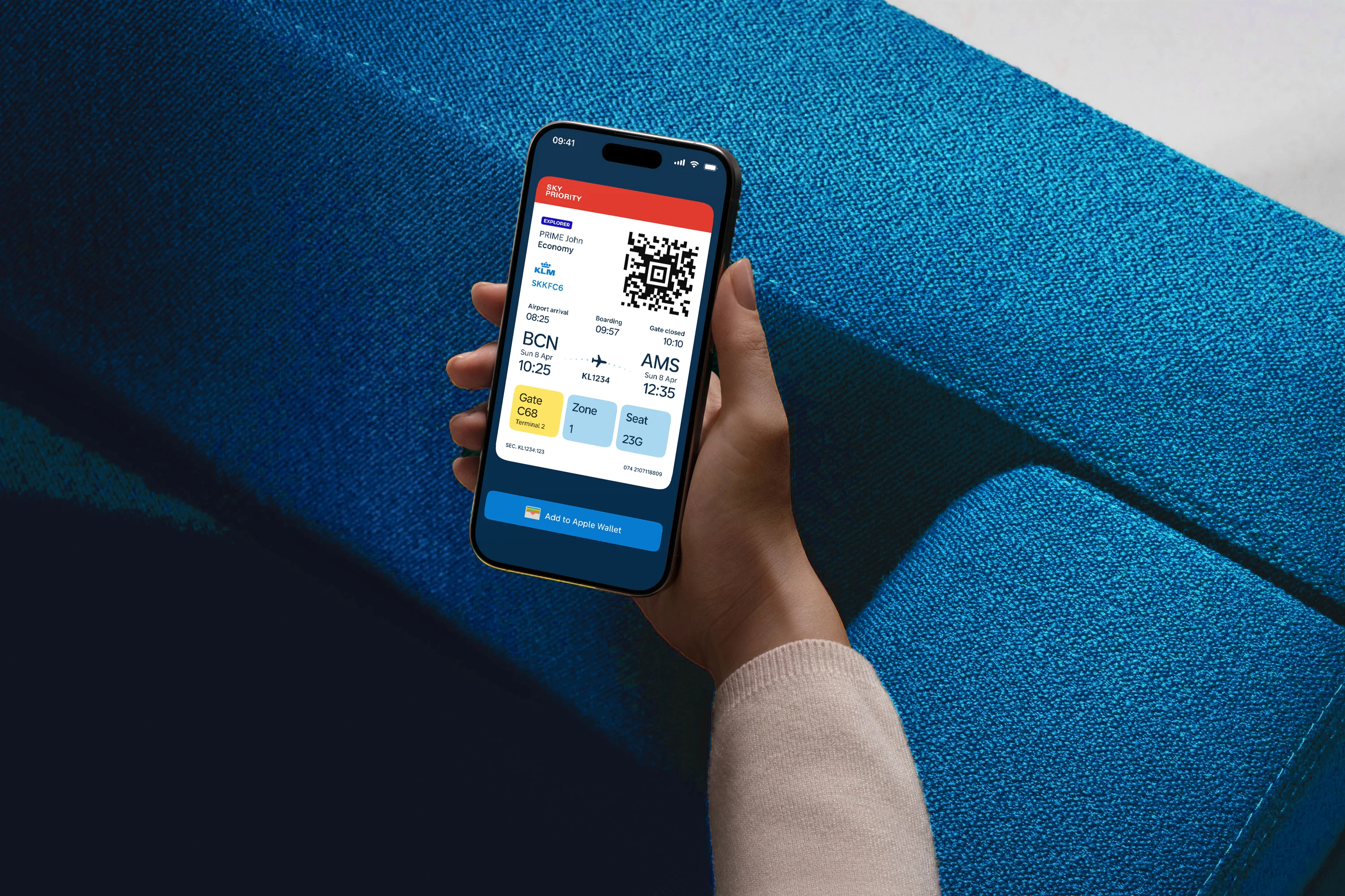
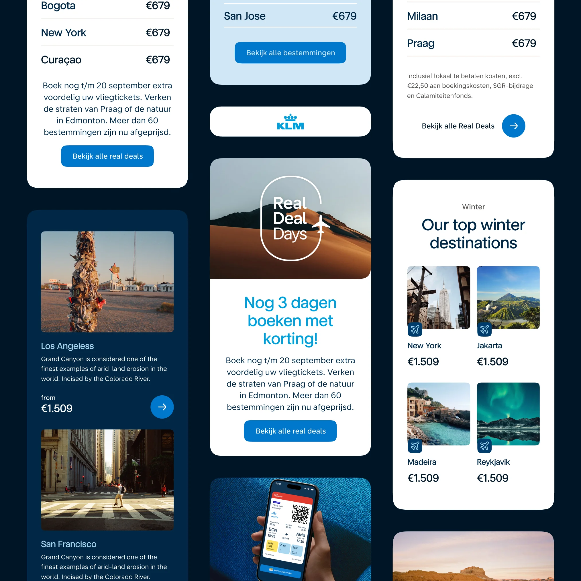
We refined the color palette to make it more flexible and more accessible across touchpoints. That meant expanding the palette, introducing more structured usage rules, and making accessibility a core part of the system so contrast and clarity were built in from the start.
We also looked closely at typography and how it should behave across different contexts, from compact digital interfaces to larger brand moments. The aim was to create a system that remained functional and readable, while still carrying a clear sense of brand.
Another important layer was shape language. We identified a soft rounded corner as a distinctive principle within the KLM visual world and translated that into interface elements such as buttons, input fields, and cards. Repeating that principle consistently helped create a more unified and recognisable experience.
Iconography as a brand expression
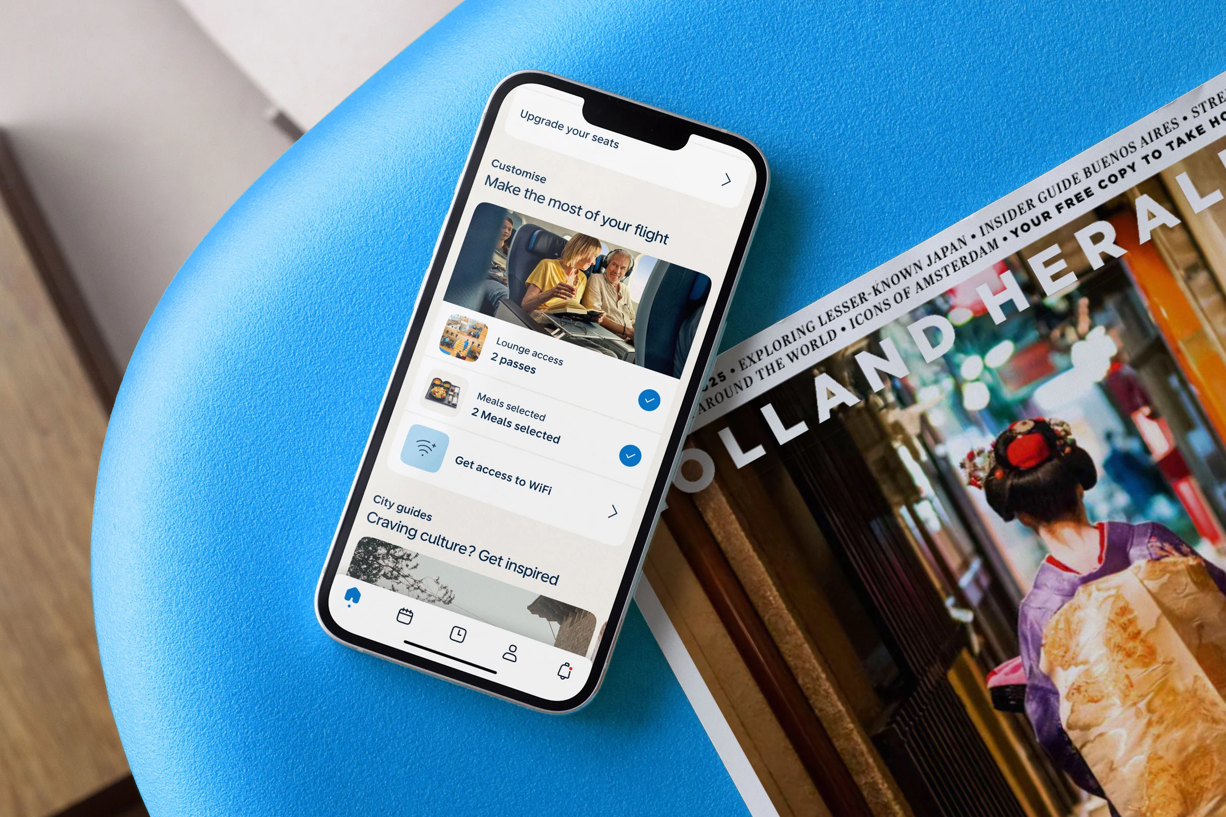
One of the areas we developed in more detail was iconography. Rather than treating icons as purely functional assets, we designed them as an extension of the brand system.
The icon set was built to align with both KLM's shape language and its typography. Rounded corners were used where appropriate, while open forms such as arrows kept sharper endings. That balance helped the icons feel both friendly and precise, and gave them a stronger relationship with the broader visual identity.
We developed the set across multiple sizes, including 16, 24, 32, 48, and 64 pixels, and created both outline and filled variants. This made the system more flexible in product use, and also added a useful interaction layer, for example by using filled icons for active states.

Extending the system beyond UI
The work went beyond interface design. Together with Buck, we helped shape a new illustration direction for KLM. In parallel, we worked closely with Rob Wienk to develop a motion system that defined the foundation for how the brand moves.
This was not about adding decorative animation, but about creating a considered motion language rooted in the identity itself. The system established clear principles for timing, transitions, rhythm, and behaviour, so motion could become a consistent brand asset across touchpoints.
That foundation could then be applied across a wide range of use cases, from product interactions and loading states to campaign assets, video, and other branded moments. By approaching motion as a system rather than a layer of polish, we helped make the KLM brand feel more coherent, recognisable, and intentional in motion as well as in static design.
The Result
The result was a more cohesive and scalable digital brand system for KLM, built to work across a wide range of touchpoints and teams. By strengthening the foundation first, we were able to create a clearer connection between product, marketing, and brand expression, helping the digital experience feel more consistent, recognisable, and distinctly KLM.
Scope
The scope of the KLM project extended from strategic definition to practical implementation across the digital ecosystem. It included shaping the brand direction, defining the principles behind the experience, rebuilding the visual foundations, and creating the tools and guidelines needed to apply the identity consistently across teams and touchpoints.
Included in the scope
- Concept design
- Brand and strategy workshops
- Brand strategy
- Design principles
- Experience design principles
- Updated foundations such as typography and colour
- A new icon library of 400+ icons
- A brand playbook
- Guidelines for digital marketing and campaign assets
- Guidelines for internal communication
- A fully redesigned e-mail design system for all marketing and service emails
- Photography guidelines
- A new illustration style developed with Buck
- Redesigns of key pages and core journeys
- Stakeholder presentations for internal and external teams
- Redesigns of key pages and core journeys